
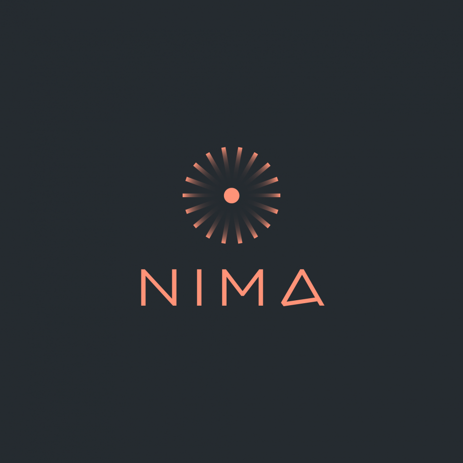
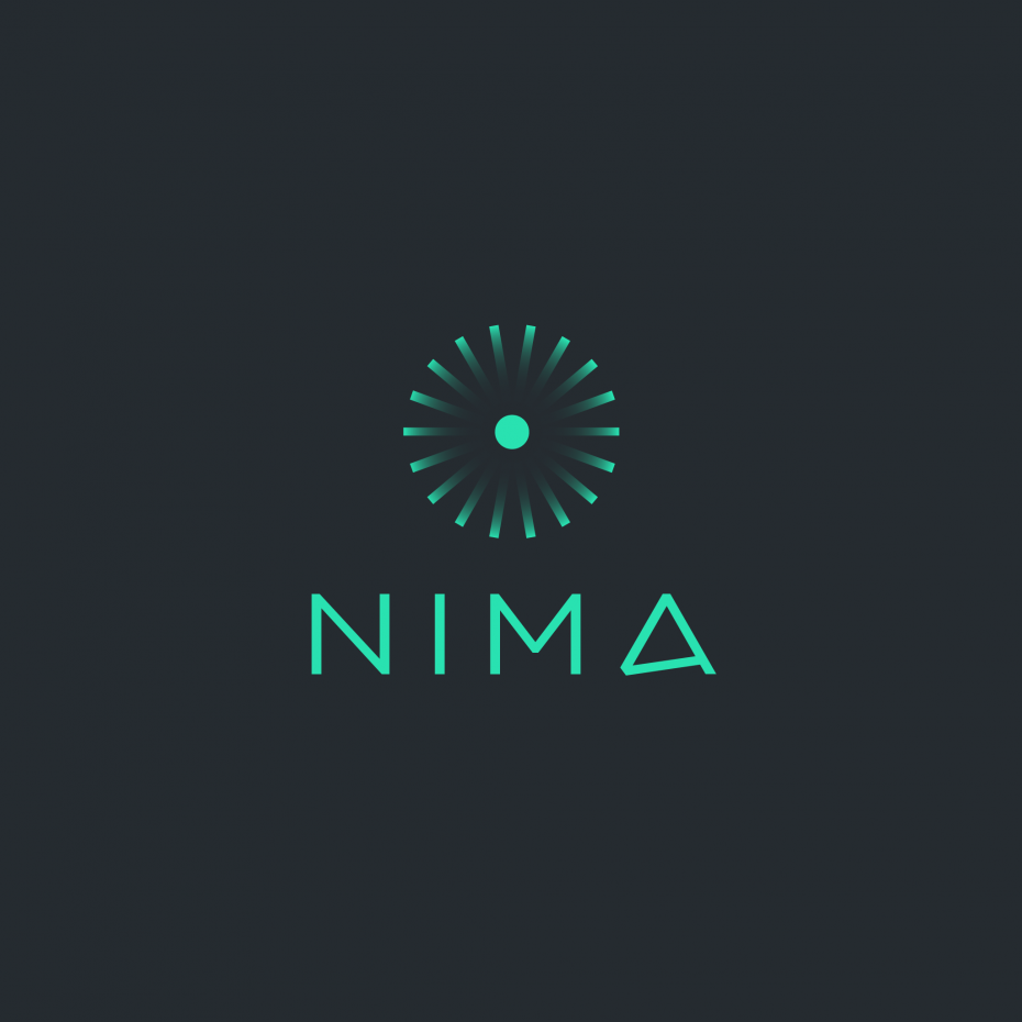
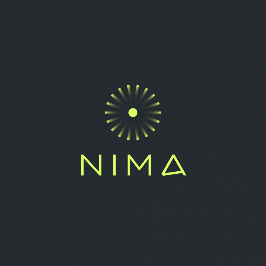
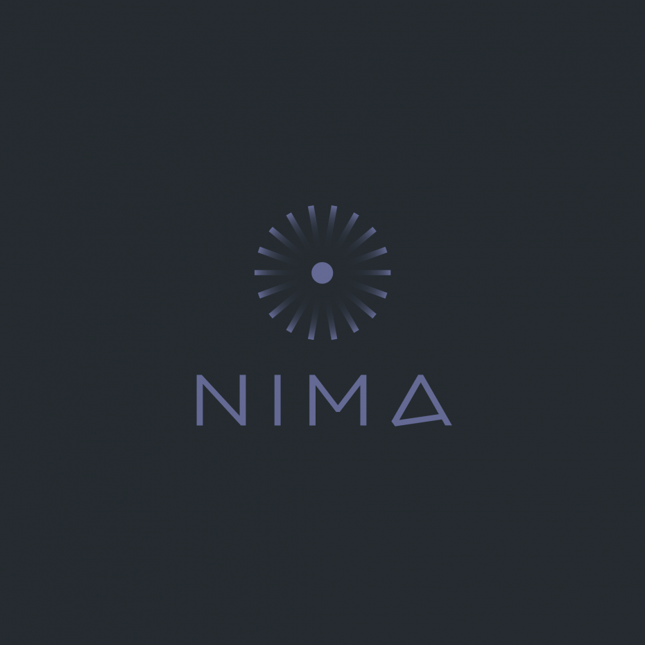
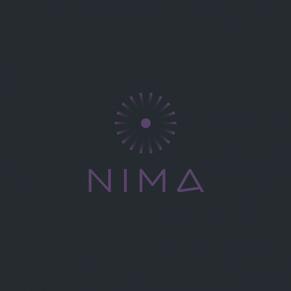
Nima is the first portable sensor for food allergens that returns your test results in 2 minutes with 99.9% accuracy. In early 2015, Pretty developed, with Nima’s small crew, a custom typeface, mark, palette, language for Nima’s values, and design & language for a holding site, and later its initial site. Nima’s typographic and visual marks came from an intensive three-day charrette with the team onsite, followed by final design honed offsite. The mark is a very literal illustration of the chemistry test strips Nima uses to find allergens, arranged in a starburst based on the unusual angled leg of the A (which is itself an illustration of the Nima). Time Magazine called Nima one of the 25 best inventions of 2015. Nima was the winner of the 2015 TechCrunch Hardware Battlefield, and is now shipping.
Nima
Identity system including logo, custom typefaces, color & cards, and site for an allergen detector.
02 29 16
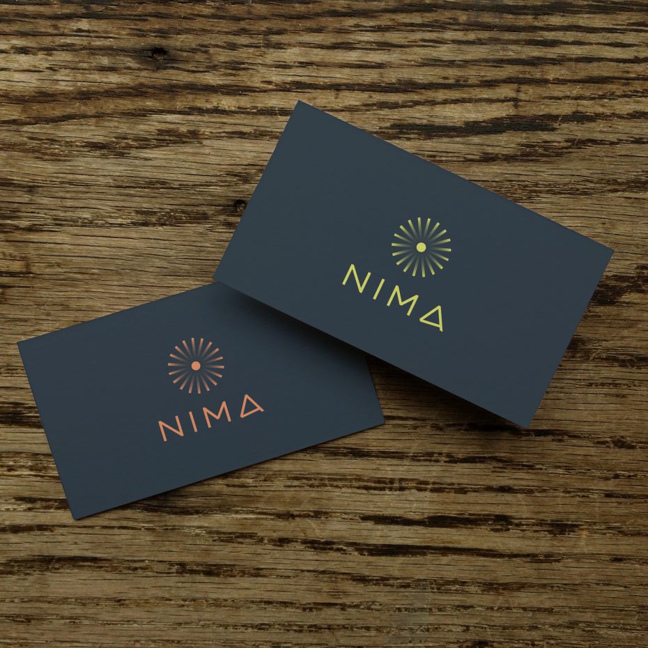
Nima's palette was developed to be "a glint of color in the dark." The primary logo can be rendered in 1 of 5 colors, with 2 of them reserved for interface elements on a white background.
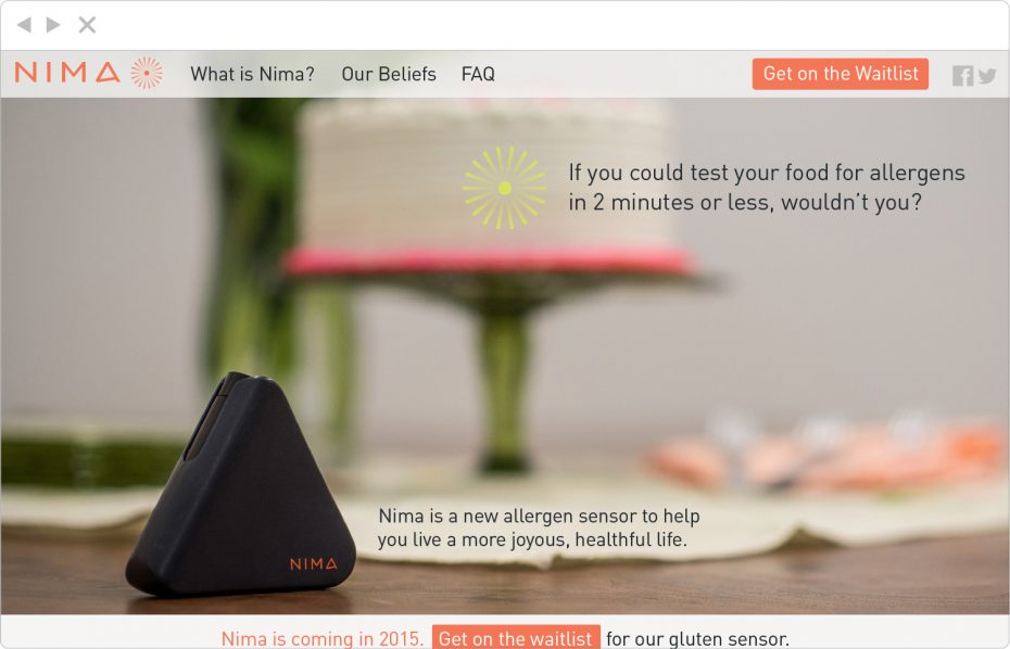
Front page of the initial site, showing Nima's prototype model in use.
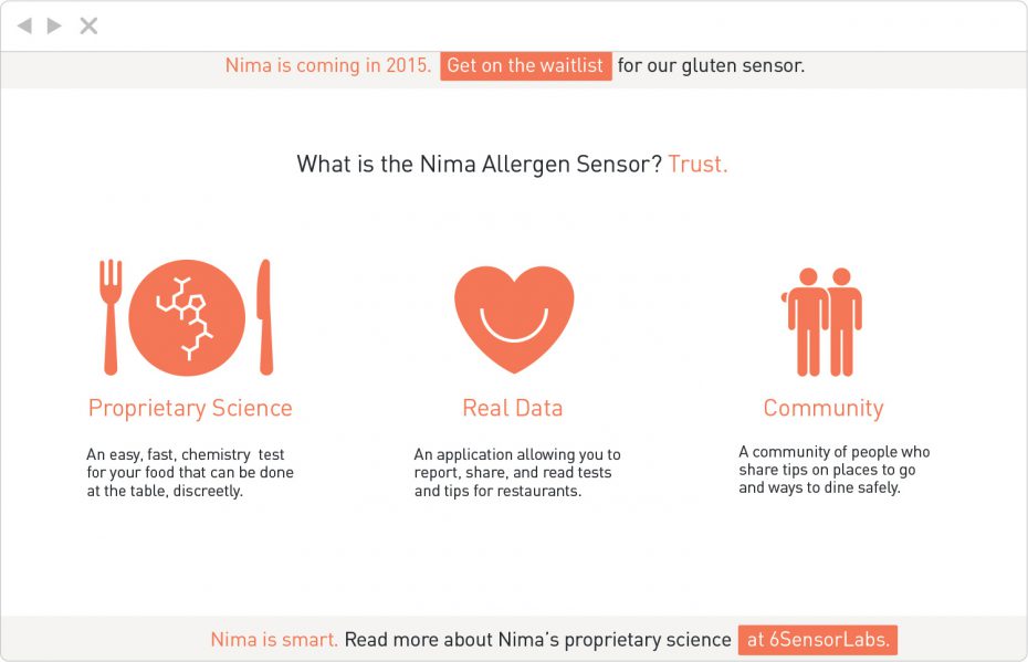
Imagery and iconography depicting Nima's core characteristics.
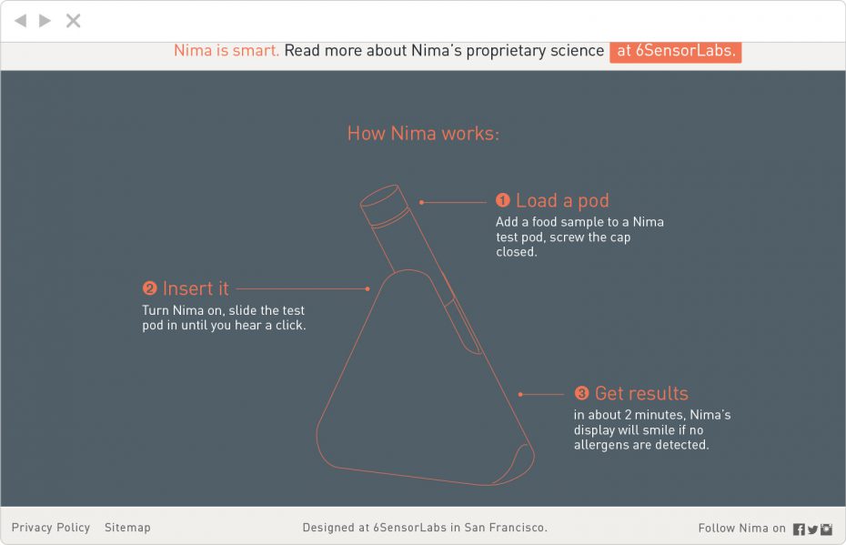
An at-a-glance usage illustration, showing how Nima works at the dinner table.

Language tailored to quickly & easily convey Nima's core values.
Project categories: Brand Development, Code